 +91-9540344454 / 9999344454
 Cognitive Load Presentation Design [Pro Tips]

When crafting a presentation, the ability of your audience to absorb and retain information is pivotal. We at Recherche Digital prioritize the clarity and effectiveness of your message. By understanding and managing cognitive load through thoughtful design, you elevate the educational impact of your content. Through this post, gain insights into harnessing design principles and strategies to create presentations that truly resonate.
Minimizing Cognitive Overload in Presentations
When you present information to an audience, their ability to process and remember it is crucial. Cognitive load refers to the mental effort required to learn new information. It’s the brain’s workload when processing a presentation, and if we overload it with unnecessary details, the main message can get lost. For instance, if a slide is packed with text and complex graphics, viewers might struggle to grasp the key message. Our brains simply can’t handle too much information at once.
To ensure audiences engage and retain the material, your presentation should balance three types of cognitive load:
- Intrinsic Load: This is the complexity inherent to the content. If you’re presenting on a technical subject, this load may naturally be higher.
- Extraneous Load: This includes anything that doesn’t support learning, like irrelevant graphics or intricate slide transitions.
- Germane Load: This involves effort that positively contributes to learning, such as drawing connections to previously learned concepts.
Balancing these elements in your design is not just good practice; it’s a show of respect for your audience’s time and attention. When done right, it leads to more effective learning experiences. Consider these techniques for keeping cognitive load in check:
- Simplify Your Slides: Wherever possible, use clear and concise language. Too much text or overly complicated diagrams can overwhelm your audience.
- Visuals Advantage: Use relevant images or diagrams to complement your message, following advice from resources like improving retention with visuals.
- Build Concepts Gradually: Introduce one idea at a time to help audiences follow along and understand the material.
- Sync with Your Speech: Avoid competing with your slides. If you’re speaking, keep the text on the screen to a minimum.
- Be Mindful of Design: Apply principles that reduce non-essential effort, like proximity of related contents and consistent design formats.

Here are a few strong opinions on maintaining low cognitive load:
- Never read slides word for word. It’s ineffective and disengages your audience.
- Ditch distracting animations. They often add more style than substance.
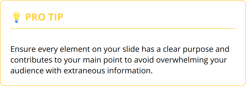
- If something on your slide doesn’t support your main point, delete it.
In crafting a presentation, the ultimate goal is to make complex information understandable and memorable without exhausting the audience’s mental capacity. Aim for a presentation that enlightens, not one that exhausts. Keep your slides graphic-oriented and your message crystal clear to ensure maximum engagement and retention.
Streamlining in PPT Design for Better Understanding
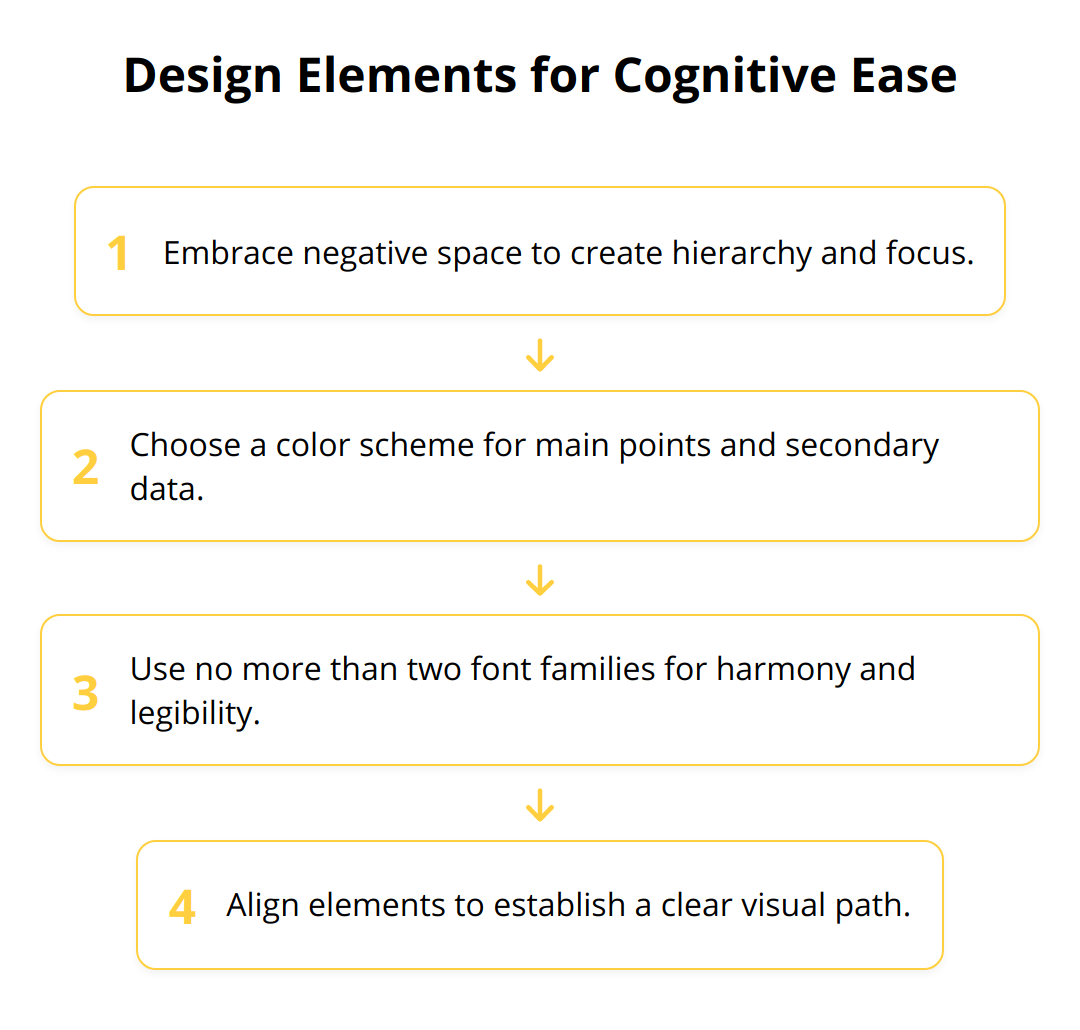
An efficient presentation hinges on principles that anticipate and accommodate viewer comprehension. Crafting a digestible visual experience is paramount; this is where design elements such as the intelligent use of white space and minimalist aesthetics take center stage. White space is not empty space; it’s a powerful tool that frames your content, allowing each slide to breathe and letting your message stand out. The space around your words and images is just as impactful as the content itself. Likewise, minimalist design is not about stripping away creativity but about enhancing focus on what truly matters.

Effective presentations also lean on the judicious use of colors and fonts. Colors evoke emotion and help categorize information, so selecting a palette that is not only pleasing but functional is key. Consistent and strategic color use guides the viewer’s eye and segments data efficiently. Similarly, fonts contribute to readability and the overall tone of the presentation. While creativity is tempting, clarity is essential. Always choose fonts that are easy to read and cohesive throughout the presentation. Here’s how to leverage design for cognitive ease:
Rather than compelling the audience to sift through clutter, your slides should pave a seamless path to understanding. Remember, in a presentation, simplicity triumphs, and restraint is a virtue. In the spirit of actionable guidance, here is a bullet point summary:
- Exploit white space for emphasis and structure
- Adhere to a color scheme that underlines key concepts
- Opt for legible fonts, like Sans Serif, that guarantee readability across various screens (tips for selecting fonts).
- Ensure alignment for organized visuals and straightforward navigation
By adhering to these principles, presenters not only command attention but also foster an environment where learning thrives. Every design choice should aim to facilitate understanding and remembrance, not merely to decorate. Each slide is a chance to convey a precise piece of the story; wield design with purpose, and your audience will thank you for it.
Managing Cognitive Load with Chunking and Storytelling
When it comes to Powerpoint presentations, less can often mean more. By breaking down your content into smaller, more digestible pieces, we call this process chunking. It’s like serving a multi-course meal instead of a giant buffet; your audience can savor each part without feeling overwhelmed. This technique aligns with our brain’s penchant for processing limited bits of information at once—usually around seven items. Therefore, organize your content into clear, manageable sections, each focusing on a single concept. This approach can significantly enhance understanding and retention, making your presentation an effective tool for communication and education.
Chunking Information
- Group related points together to create a narrative flow.
- Use bullet points to highlight key elements without the fluff.
- Leave pauses or introduce breaks between chunks to let the information settle.
- Reinforce chunks by summarizing core ideas before moving to the next section.
Moving beyond organizing information, narratives and storytelling can profoundly impact memory and engagement. Stories are not just for children’s books; they have the power to drive home points in a way that pure data never could. By weaving your points into a narrative, you assist your audience in making emotional connections, which studies show are vital for memory. The narrative can serve as a vehicle for the points you’re trying to convey, making the complex information more relatable and memorable.
Incorporating Narratives
- Start with a compelling hook that relates to your main message.
- Use the power of conflict and resolution to emphasize your points.
- Anchor abstract concepts in real-world contexts that resonate with the audience.
- Utilize testimonials or case studies like crafting presentations with stories to add authenticity.
Let’s not forget, your ultimate aim is to communicate effectively. Although you have this wealth of strategies at your fingertips, it’s important to select the right approaches tailored to your content and audience. Each presentation is unique, so while chunking and storytelling are extraordinary tools, use them judiciously to ensure they align perfectly with your goals. A masterfully crafted presentation is one that respects the audience’s cognitive constraints while engaging them deeply—striving for that balance is the hallmark of a seasoned presenter.

Wrapping Up
As we bring this dialogue on presentation design to a close, we reaffirm the essence of understanding cognitive load and its profound impact on audience reception. It’s about striking a balance, ensuring our messages do not just reach ears but also take root in minds. At Recherche Digital, we consistently apply the principles of cognitive load to optimize information retention for any audience. Our commitment is always to presentations that aren’t just seen but are also remembered and acted upon.
![Key Takeaways - Cognitive Load Presentation Design [Pro Tips]](https://bharatgrouponline.com/wp-content/uploads/2024/02/Cognitive-Load-Presentation-Design-Pro-Tips-6-2024-02-10-070647.3969580000.png)
Throughout our discussion, we provided practical advice, aiming to transform the daunting task of presentation creation into an achievable art. Simplifying slides, harnessing visuals, and narrating stories are key strategies that presenters should emphasize. Our pro tips ensure that the intrinsic, extraneous, and germane loads are carefully calibrated for an impactful presentation experience.
The significance of continuous improvement cannot be overstated. As presenters, it’s imperative to evolve, learn from each speaking engagement, and integrate new insights into our approach. The landscape of audience engagement is ever-changing, and so should our strategies for connecting with them. The meticulous crafting of each presentation is a progressive journey towards mastery.
By visiting Recherche Digital, you can explore our esteemed Golden Frame Presentation service — a culmination of best practices in audience engagement and informational design. We stand behind our ability to enhance your business presentations with a 100% Money Back Guarantee. Elevate your presentation narrative with our award-winning expertise and services that ensure your data is not only presented but also protected.
In summary, design purposeful, clear, and engaging presentations that honor the cognitive capacity of your audience. If you aim to inspire, persuade, or educate, these principles are your toolkit for developing presentations that leave a lasting impact:
- Prioritize message clarity
- Strategically use visuals and storytelling
- Offer bite-sized information chunks
- Steer clear of non-essential content
- Foster an environment for effective learning
Remember, each presentation is a journey through your audience’s mind. With each slide, you have the power to facilitate understanding and kindle action. Continue enhancing your skills, listen to feedback, and never miss an opportunity to polish your presentation craft, ensuring that your message doesn’t just speak volumes, it resonates deeply.