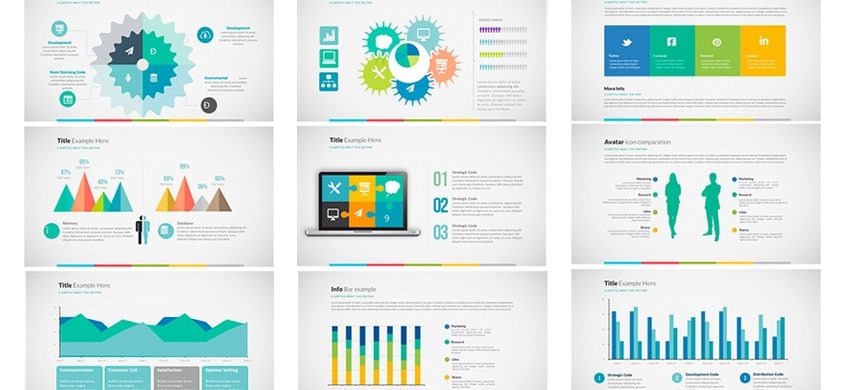
Well-thought data-presentation makes a PPT exceedingly effective

PPTs are constructed to garner business. But if intelligently crafted, they can be massively entertaining. Facts, figures and data can be inserted engagingly. Aptly presented in a wrap of story, different statistics and data send out convincing message for target-audience. If these statistics bring sometimes surprise and sometimes awe on audiences’ faces, then they can be termed engaging and they are more likely to make your overall presentation impactful.
Use of data in PPTs has come of age. Newer trends and features have been adopted. Data-arrangement and data-analysis have taken many leaps and you can very well empower your PPT with these well-sorted data. Excellent PPTs always bear a definite rhythm in their flow. You can use various infographic tools, animations, charts and diagrams to inject rhythm and clarity in your PPT. Revenue-projections, client-outreach, profits, exit-model; everything can be shown in an elucidatory way. But for all of this, your data have to be filtered, arranged and simplified. Convoluted facts and figures can confuse your audiences. Data and statistics well-woven in the basic storyline capture the imagination of audiences seamlessly. Your numbers must not seem disintegrated from the rest of your PPT.
In this age of overflow of trade-related data today, data-processing has become increasingly significant. You must be keen and prepared to leverage properly processed data in your PPT in a way that they provide your audiences with key insights in accepting your offerings. Well-processed data in different graphical and diagram-presentations in your PPT become highly enlightening and engaging. These figures and numbers must put across your ability to deliver products or services which solve their problems big-time.

 +91-9540344454 / 9999344454