 +91-9540344454 / 9999344454
 PowerPoint Visual Storytelling Tips: What You Need to Know

We at Recherche Digital understand that the art of visual storytelling can transform a standard PowerPoint presentation into a compelling narrative that captivates audiences. The fusion of impactful visuals and a cohesive color scheme, aligned with your brand, can make your message resonate more profoundly.
Mastering design techniques like animations, transitions, and data visualization is foundational to enhancing your PowerPoint’s appeal. Aligning your presentation’s content and script is just as critical in ensuring your story is delivered clearly and effectively, making each slide a memorable one.
Crafting Your Narrative Flow
In the realm of presentations, visuals are not just ancillary elements; they are the core drivers of your narrative. A powerful visual can convey a complex idea much more effectively than a bulleted list. Whether you’re pitching to investors or educating a classroom, the images you choose should be more than just attractive – they must carry weight and meaning, enhancing the narrative that you’re trying to convey.
Equally impactful is the strategic use of color schemes and brand elements in your PowerPoint slides. Consistency in design not only strengthens brand recognition but also creates a professional and unified appearance throughout your presentation. The colors should reflect the tone and emotion of your message; for instance, vibrant colors can energize your audience, while cool tones might convey a sense of calm professionalism.
But it’s not just about dazzling your audience with impressive visuals and coordinated colors. The true power lies in constructing a narrative flow—a storyline that guides your audience through each point with purpose and intent. This structured narrative transforms your PowerPoint from a sequence of slides into a persuasive journey.
Here are a few actionable tips to elevate your PowerPoint narrative:
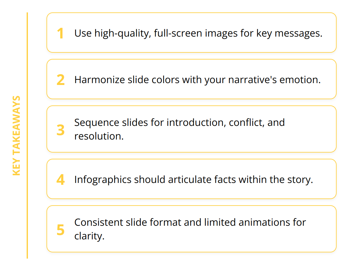
- Select images that encapsulate key messages: Opt for visuals that directly support your talking points, whether it’s conveying urgency with a striking chart or illustrating growth with an upward trending graph. Prefer high-quality, full-screen images that speak volumes without the clutter of words.
- Harmonize colors with your story: Use color psychology to your advantage by selecting hues that evoke the desired emotional response related to your content.
- Sequence slides to build your story: Begin with an introduction to set the scene, follow with a crescendo of conflict or challenges, and conclude with a resolution that ties the plot together.
- Tie data into the narrative: Use infographics and data visualizations to articulate the facts and figures as part of the story. They should serve as proof points that bolster your argument, not as standalone distractions.

Remember, each slide of your PowerPoint is a scene in your story, a step in the journey you’re taking your audience on. The aim is not just to share information but to share it in such a way that it sticks, that it influences, and, ultimately, that it persuades.
Engaging Slide Design
Designing slides is like painting on a digital canvas, where every element plays a specific role in conveying your message. Top-tier presentations hinge on slides that aren’t just informative, but are consistently branded and engaging to look at. Let’s get into the details of producing a PowerPoint presentation that leaves a lasting impact on your audience.
Optimized slide layouts are the foundation of professional presentations. Align elements carefully and use grids to maintain visual balance. Never underestimate the power of white space—it brings clarity and focus to your key points. A crowded slide is a quick way to lose your audience’s interest.
Animations can be a double-edged sword; used judiciously, they can emphasize important elements and guide the viewer’s eye. However, resist the temptation to overdo it—over-animating can distract and confuse. Strike the right balance with purposeful animations that support your narrative, not upstage it.
Incorporating infographics is an art. They allow complex data to be digested at a glance, transforming numbers into stories. Powerful data visualization is more than just pie charts and bar graphs—it’s about showcasing trends, relationships, and changes in a way that instantly clicks with the viewer.

Here’s how you can enhance your presentation:
- Stick to a consistent slide format across the board for a cohesive experience.
- Limit animations to key points to maintain a professional tone.
- Choose infographics that align with the narrative to reinforce your message.
An often-overlooked aspect is the emotional effect your visuals can evoke. Every curve, line, and shade in your presentation has the potential to stir emotions and solidify your message in the memories of your audience. After all, people may forget what you said, but they’ll always remember how you made them feel.
To give your visuals even more depth and detail:
- Ensure all visual elements match your brand for instant recognition.
- Use data visuals to tell a story with your figures, not just present them.
- Utilize contrasting color schemes for visuals to make essential details pop out.
Remember, less is more when it comes to text. If you can say it with an image, do so. If a complex idea can be distilled into a simple icon, you’re on the right track. High-contrast, legible fonts should deliver your points, while the power of the visual narrative does the heavy lifting.
By blending these strategies, you’re not just presenting; you’re creating an experience, taking the audience on a visual journey where each slide brings them closer to your intended conclusion without a word wasted.

Aligning Content with Visuals
Mastering the synergy between your PowerPoint content and visuals is a game-changer in conveying a message that sticks. A standout presentation flawlessly aligns its written content with engaging visuals, crafting a seamless experience that keeps the audience hooked from start to finish.
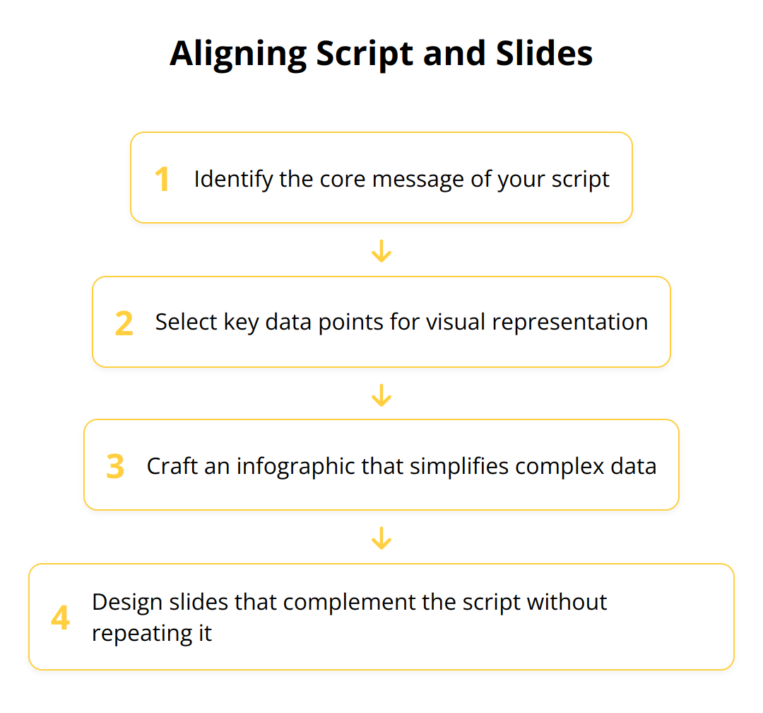
Synchronize Script and Slides
Every compelling presentation hinges on the harmony between what’s said and what’s shown. A common pitfall is to craft slides that either replicate the spoken word or, conversely, have no relation to it. This disconnect can confuse the audience, diluting the impact of your message. Instead, synchronize your script with your slides in a way that each amplifies the other. For example, let an infographic do the heavy data-lifting while your script provides engaging narrative context.
Condense Content for Clarity
Less is often more when it comes to presentation content. Slides crowded with paragraphs will overwhelm and lose your audience. The key is to distill your content to its essence. This doesn’t mean omitting details; it means being strategic about them. Keep your slides clean and focused, with bullet points that highlight the core message. This gives you the breathing room to elaborate verbally, providing a richer, more comprehensive understanding. Refer to techniques that pace your PowerPoint effectively.
Image and Text Equilibrium
Balance in slide design is not only aesthetically pleasing but also critical for audience retention. The right mix of text and imagery can make or break your presentation’s effectiveness. Instead of treating text as a primary source of information, consider it a supplement to your visuals. Choose striking images that evoke the desired sentiment and pair them with short, punchy text that reinforces rather than repeats.
Here are actionable steps to ensure your PowerPoint presentation’s content and graphics work together:
- Select impactful visuals: Choose images that illustrate your script’s main points in a powerful, yet relatable way. When discussing growth, use a graph that shows a clear upward trend. For discussing frameworks, an easy-to-understand diagram can be more insightful than words.
- Trim the text: Eliminate any superfluous words on your slides. Use only as much text as needed to complement the imagery and provide context.
- Consistent pacing: Maintain a steady rhythm from slide to slide. A visual story with uneven pacing can disengage the audience, so align your script with the visuals to provide a smooth, consistent experience.
By meticulously aligning your PowerPoint’s content with your visuals, you ensure that every element on the screen serves a purpose in telling your overall story. Bold images coupled with insightful text transform your presentation into a narrative adventure that conveys your message with precision and power.
Final Thoughts
To wrap up, strong visual storytelling in PowerPoint presentations is not just a skill; it’s an essential strategy for engaging audiences and delivering messages that stick. By harnessing the tips we’ve shared, presenters can create captivating narratives, laced with emotion and clarity, that resonate with their viewers long after the screen goes dark.
Visual storytelling turns data into dialogue and slides into stories. The impact of high-quality, consistent presentations on audience engagement cannot be overstated. When visuals and content work in unison, the result is an immersive experience that informs, inspires, and influences.
As we continue to explore the vast potential of PowerPoint design, it becomes clear that the journey towards mastery is ongoing. The landscape of design is ever-evolving, and staying abreast of new trends, tools, and techniques is vital for anyone looking to make a lasting impression through their presentations.
We at Recherche Digital pride ourselves on crafting bespoke PowerPoint designs that capture the essence of your brand and message. Each slide is a testament to our commitment to elevating your business narratives and ensuring that your presentations stand out. Our Golden Frame Presentation service is designed to give you a competitive edge, making each point memorable and compelling.
In your pursuit of presenting excellence, consider these key takeaways:
- Empower your slides with high-quality, relevant images
- Harmonize your design elements to impactfully convey your message
- Fine-tune text and visuals for a seamless viewing experience
- Engage in continuous improvement and adaptation to design trends
We’re dedicated to your success, and our extensive portfolio is a reflection of our industry-leading expertise. Our PPT designers work with the precision and passion necessary to bring your vision to life.
By integrating these strategies with Recherche Digital’s services, you are set to craft presentations that not only share information but truly connect with your audience. Whether you’re looking to refine an existing presentation or create something entirely new, we’re here to support your vision every step of the way. Let’s forge ahead, ensuring that every presentation you deliver is an experience that captivates, educates, and ultimately converts.