6 tips to design Pitch deck that investors love to see ( & fund)
How to prepare an Investor Presentation
Recently start-ups have re-energized entrepreneurial spirit and injected positive rivalry into Indian economy. Our economy has got a fresh and reinforcing boost with these dynamically agile start-ups. And an Presentation has emerged as an impactful tool for start-ups to get investors on board with them. An Investor Presentation or Fund-raising Presentation is a PowerPoint-based short but effective method for Start-ups, which enables them to communicate a swift and speedy summary of their business-plan to their audience. In fact, an Investor Presentation helps start-ups carve trust for them in their respective potential investors.
In this submission, I suggest to you 6 vital tips for your Investor Presentation which, when assimilated, would make your business-plans or ideas trustworthy and help you attract investments for your start-up from your prospective investors.
6 Tips for an Investor Presentation
If you don’t have a good stretch of time to read them all, you can directly go to a specific point below in the list and click it to read it comprehensively:
- 10-11 basic contents of an Investor Presentation
- 8 Fundamental facets of an Investor Presentation
- 8 Tips to write a compact textual content in an Investor Presentation
- 6 simple tricks of image-selection in an Investor Presentation
- 16 Tips on designing in an Investor Presentation
- 7 Things must be avoided in an Investor Presentation
1. 10-11 basic contents of an Investor Presentation
After a deep-drilling into several Pitching Presentations seeking Seed Fund, it has been observed that a fool-proof Pitching Presentation must have a definite set of content-ingredients which must be highlighted proportionately:
- Profile and purpose: The opening or the 1st slide of your presentation must have a succinct but impressive overview of your profile as an entrepreneur and the purpose behind starting a specific business by you. Otherwise, the opening slide may also carry your Logo, business-name and a tag-line which collectively must refer to what you are going to come up with for the potential investors.
Example:

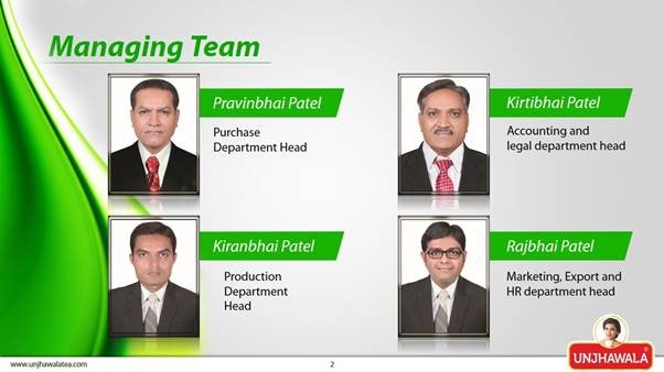
- Team: Then comes the next slide with a clear and summarized portrayal of the skills and insights of the people who are with you in this specific business. Knowing that when investors invest money in your start-up, they not only invest for your idea, they invest in your team’s credibility as well, you must ensure that they get to know the people who are going to make your idea successful. Your team’s combined efficiency makes a solid base of trust in your prospective investors for your business-plan.
- Trouble: The problems or difficulties you found and researched in your prospective business-field, regarding products or services, must be presented clearly in your presentation. Check out this pitch deck

- Understanding: Now after the research, when you know the complexities, how you have developed the understanding of the field can be elaborated in the next slide.
- Solution: How your products and services solve the troubles you found for people must be communicated on the next slide.

- Description of products or services: One of your slides must contain a complete but short explanation of your products or services.

- Scope of your products or services: You must show the scope of your products or services in the existing market to your potential investors and that can be done by presenting the big size of the market or the industry with some corroborating facts and numbers on the next slide. Enormity of the spread of target-clients, client-acquisition-costs, various opportunities, all of this must be dealt here.

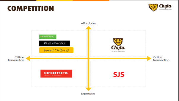
- Competition: How your offerings score over the other options available in the market and how you would tackle your competitors has to be presented concisely.
- Revenue-model: Every investor wants to get his money back, so how your business generates revenue must be presented in an unambiguous and illustrative manner. Commercial inferences are the most important subject for your potential investors. Generation of revenue, time-wise listing of various revenue-streams, pricing of products or services, price-comparison with others in the market, if possible, all of this is a vital set of information for your potential investors. It is tricky to evaluate financial projections for a start-up, as it doesn’t have a long financial experience. Your projections may carry constructed presumptions and deductions.
- Investment: The amount of money you want to arrange to run the business must have logic and that amount and the logic must be presented clearly. If you have already got investors on board, how much has been invested, who are the investors and what did you do with the fund, you must mention these details concisely. If your start-up has been a self-funded venture thus far, you must mention it emphatically because investors tend to draw a huge boost to invest their money in something from the risk, already taken by others.
- Contact: Your contact-details must be clearly presented in the last slide.
2. 8 Fundamental facets of an Investor Presentation
A Fund-raising Presentation, which you prepare for your prospective investors, may be a minutely detailed portrayal of your business and its finer aspects, but it must be concise and compact for sure for better results, in terms of its impact-value. Empowered with these 8 fundamental facets, your Fund-raising Presentation can make an indelible impression on the minds and hearts of your potential investors:
- Involve audience with a story-line: Movies, dramas or real life, a story makes a deep impact and carves enduring memory in us. Your presentation must have an underlying story-line which catches the attention of your target-audience right at the start and retains it till the last. An elongated attention from investors creates more possibilities of investments for your venture. And that’s why, your Pitching Presentation must have a specific alignment in building the curiosity-quotient vis-à-vis your business.

- Don’t stuff slides with excessive information: Excessive information on slides turns them into a clutter. A human mind works better when he keeps digesting information, one-by-one. Information-overdose has every chance to confuse him and that’s where your presentation falls flat.
Clarity of message and not more than 10-15 words per slide must be the mantra. Your main message on a slide must not be distributed in more than 3 points and certainly, not more than 3 sub-points, if required.
- Short and sweet works: Investors are busy people, so you must prepare your Pitching Presentation which duration-wise doesn’t go into the realm of being termed as ‘long’. 10-15 slides or 15-20 minutes augur well to sustain their attention.
- Make a great start: First impression is the last impression; this adage fits properly for your Pitching Presentation. When you involve someone at the start, there is every chance that his involvement would be sustained, as an absorbing start almost ensures his curiosity for the entire presentation. An engaging start in any way, with a well-written tag-line defining the motto of your initiative, well-written interesting essentials comprising the core of your business, captivating design, fascinating images, your impressive profile or an exciting Logo referring to your business, does a world of good for your Pitching Presentation.

- Start with conclusion: Once they get to know their benefits at the outset, the investors find it easier to understand how the information being depicted validates those benefits. And then, they remember the key message better and prepare themselves mentally for making investments.

- Highlight achievements of every team-member: Prospective investors always carry this feeling that your business is as good as your team. When they get to know achievements of your team-members in different domains, they develop a certain confidence in your endeavour. More than your idea, they would like to know and assess your work-force which would convert their money into big gains. Every member’s past individual successful stints must be highlighted. Your association with present team-members for a longer period instills a confidence in investors for your business and that must be shown.
- No distraction: Creativity is alright, but it must not overlap the crux of your main message. Size and font of words, colours, background, images etc. must be in sync with each other and contain a fair bit of consistency in their depiction.
- A conspicuous understanding of business-arena: The presentation in its entirety must reflect the depth of your understanding of the business-arena you’ve chosen. This palpable understanding, emanating from your presentation, builds confidence in investors for you and your start-up.
3. 8 Tips to write a compact textual content in an Investor Presentation
- Right from the beginning, the heart of the presentation or the main goal of the presentation must be kept in mind. Every sentence must be formed as per the basic and generic interest of the specific target-audience.
- Different contents on different slides must go well together. Presentation of facts must have regularity. Unsystematic detailing can ruin the presentation!
- Choice of words must be in line with the general intellect of the prospective investors. You must write easily understandable and simple words to meet your purpose.
- Slides carrying significant data, figures or different statistical charts or diagrams must bear the simplest of words.
- Slides carrying main message, or the core business-plan must have simple but emphatic word-formations which highlight the crux automatically.

- If you have given the content a story-line, your story must be built on your investors’ interests with proper word-formations on each slide.
- Abbreviations must be ignored as much as possible.
- Grammatical faults can mar the purpose of any presentation suddenly; you must stay away from them and check your textual content from every grammatical angle before proceeding to the designing and other processes.
In a nut-shell, prospective investors put money on your concept and the textual matter plays a bridge to convey the concept to them.
4. 6 simple tricks of image-selection in an Investor Presentation
We humans are genetically programmed to accept and grasp pictures more easily. So, communication in any form ably supported by images or pictures gets more emphatic and effective. And that is what stands for a Pitching Presentation for investors as well.
Some simple tricks of image-selection in an Investor Presentation must be inculcated properly to make it even more impactful:
- Images and textual content on a slide of the presentation must be crafted in tandem with each other. Images must be suggestive to the words written on a slide. They must be complimentary in nature to each other. And that’s why, an apt image may need few words of yours to describe the message on the slide.

- Size of the images should be chosen as per the size of the slides. Symmetry must exist, but you must ensure that the size of the images is large enough to draw the minds of your target-audience.

- When you know your prospective investors, you can choose images cautiously to fit their specific liking or imagination. Images depicting glory, huge money-gains or rags-to-riches kind of story create a great pull for investors.
- Images should not be imposing or too big to overwhelm the word-content, written on slides.
- You should not always restrict yourself to depict only one image on a slide. In fact, sometimes 2 or 3 images in combination on one slide carry the core message of the presentation more effectively. Products or services, business-model, market-size, competition and growth can be shown in more than one images or charts and diagrams.

- Images or pictures must be selected so subtly in a Pitching Presentation that they help your target-audiences remember the textual content written alongside them. And if that happens, you will have achieved your purpose most of the times.

5. 16 Tips on designing in an Investor Presentation
Investors want to be sure about the scalability of your business, solidity of your concept and quality of your products or services. Your Pitching Presentation must have a definite creative traction in arrangement of these contents or overall designing, so that it remains absorbing to sustain their interest all through.
- A picture is worth a thousand words: Images carry far better recall-value than words for humans. Since we are far more attuned to the visual communication and are 6 times more likely to recall what was communicated through images than words, your presentation should be more visual than textual.

- Text on image: If you wish to design a slide by placing text on an image, make sure to add a black or purple overlay with a good level of transparency! The image would be conspicuous, and the textual content would be legible.

- Images on the left side of the slides: Placement of the images on the left side of the slides brings in an easy eye-flow for your audience.

- Easy legibility of the word-content: While an easy legibility of the word-content is a thumb-rule, you must be always ready to reduce the size of the font on the slide which bears a bit bigger textual stuff or contains an imposing image. Titles must be in bigger font-sizes than the general word-content.
- Selection of the Font-type: Selection of the Font-type is another area which demands creative imagination. The font of the words must match or relate to the concept of your business. A business dealing in fashion or related fields must be presented in an arty font-type. A business dealing in manufacturing or aviation sector can be presented in an innovative font.
The content wrapped in an accurate formatting or design has bigger penetration and carves deeper impressions on the investors’ minds. Normally, in an Investor Presentation, a Sans-Serif Font is frequently used for its legibility on digital screens.
-
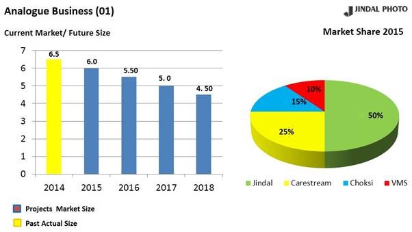
Graphical depiction of data must be thought-out: While the graphical depiction of data simplifies facts and figures, the real reason to use them should be the base-point of their type-selection. A definite rationale must lead you to a specific graph for your presentation. In other words, a chart or graph must be inserted to support the main message of your presentation.
Area-based graph depicts the correlation of different ingredients against a big entity over the time like a company’s over-all profit versus revenues of your start-up, coming through your products or services over a fixed period. |
While the column-based graph explains the variations in individual value up and down, the Bar-based graph illustrates the variations in these values horizontally. |
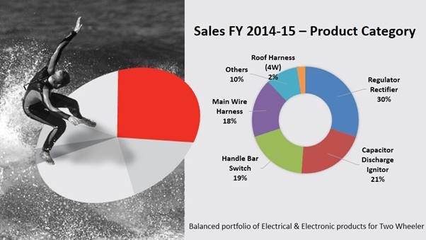
While a Pie-chart or graph carries proportion-wise distribution of something, a Line- graph comprehensibly presents data of something at different stages in time. |
A Pie-graph doesn’t show the exact value of the data and so, you must be very careful to pick this visual tool for your presentation, keeping in mind the investors’ inherent urge to know the exact amount of anything. |
Font-colours: When choosing font-colours, having conspicuous contrast with the background or having colours of the images works well.
The colour of the background and the colour of the content or images must be in sharp contrast to each other to facilitate easy viewing. |
A slide’s background with white or light-grey colour in mix with the opposite black text-colour is always advisable. |
A black background and white font also make a good pairing. |
A black background and yellow-coloured texts also make a good contrast with high legibility. |

- Background in sync with the opening slide: The choice of the background must be created with the opening slide in the mind where your company’s logo is being depicted. A striking background against the look of the logo here creates the impression of the entire presentation in the minds of the target-audiences.
- Three-part layout design: You can very well use the three-part layout design wherein you can display your start-up’s 3 core founding team-members or advisors. Additionally, if you place faces of the members of your start-up in your presentation, the presentation builds trust with your prospective investors automatically.

- Rule of Three carries a high memorability-quotient: Rule of Three is a magical formula in any presentation. It has been observed over the years that we humans gulp the message, concept or idea easily if it is presented in threes. So, a point written or shown in 3 pieces increases the memorability of your message.

- Product-images for product-features: When it comes to mentioning the product-features on a slide, don’t get tempted to use Bullet Points and write descriptive words alongside them! Your potential investors would be more inclined to have a fleeting glance on some of your product and understand their features. You can place 3 or more attractive images or screenshots of the products to meet your purpose.

- 1 image and a big empty space: If you write 4-5 words and place an image with a big empty space on the slide, you would find your audience’s attention fixed on the text and the image. You can convey a lot through few words and a single image with this kind of lay-out.

You must design the headlines of your presentation in this way. Otherwise also, having one image for one point keeps clarity in your message and it gets across to audience unambiguously. In other words, keeping too many facts or images on a single slide makes your audience confused. And if they get distracted once, it's very hard to get their attention back on the presentation.
- Horizontal Blocks: You can also segregate your information in horizontal blocks which may be equally spaced on a slide. Facts, presented in a grid-like layout, carry a good chance to be read through.
- Equal space for image & Text in a slide: Slides carrying image and textual content in an equal stretch of space magnify the visual traction of the information there.

- Stay away from elaborate technological explanations: Even if your start-up is based on technological advancements and you plan to produce new goods or services with great value-additions, make sure your Pitching Presentation doesn’t contain elaborate technological explanations! Initially investors are not at all interested in knowing the efficacy of your technological disruptions. They would like to know the market-suitability of your products or services, market-size and their own monetary gains.

- Synchronization of all the ingredients provides a striking evenness: An eye-catching evenness in a Pitching Presentation in terms of integration of all the ingredients, even the smaller ones, through the perspective of the core message makes it even more meaningful and impactful.
6. 7 Things must be avoided in an Investor Presentation
While it is relevant to embed all the essential requirements in a Fund-raising Presentation, it is also equally necessary to bear in mind what not to have in it. There are few things to be avoided:
- Too much of highlighting: Highlighting too many facts or figures on each slide may defeat your purpose. Few highlighted points draw the attention, many highlighted points deflect the attention. Bullet Points may be a customary pattern to underscore prominent aspects of business in a Pitching Presentation but overdoing it may undo your entire preparation-effort.
- Stretched out presentation: 10-15 slides augur well for any Investor Presentation, but the more you stretch it, the more boring it becomes. Your potential investors would like to see or know instantly what is there in it for them. The longer you take to reveal their advantages, the harder you make it for yourself.
- Use of heavy words: If your audience looks for dictionary to know some words written on slides, you are in for bad results. Easy, simple and flowing text descends on their hearts and minds smoothly and quickly and that is what you want.
- Disproportion in textual matter and supporting images: Too much of word-content on slides is something which should be avoided. Similarly, an excess of images on one slide can get the investors baffled, when they start to look for the most meaningful image for them.
- A palpable deficiency of understanding of the core subject: Author Dave Paradi says, “The big problem with business-presentations is not boredom but rather confusion”. A confusing description of your business-plan or idea transmitting unclear, little or half-baked information irks your prospective investors the most.
- Inapt font-size: Inappropriate font-size, in which words become illegible from even a shorter distance, makes all your efforts go awry. Summarily, smaller fonts to accommodate different creativity-churnings take you nowhere.
- A premeditated use of Animations must be avoided: Animation can enhance the overall visual effect of a Pitching Presentation as in any PPT, but you certainly should stay away from using it in a premeditated manner. The animation portraying important information must be totally amalgamated with different contents on other slides. Bear in mind, animations augur well in an Investor Presentation, when they are short and easily graspable.
All-in-all, when you craft a Pitching Presentation specifically for investors, you must bear in mind that they are the people who generally are inundated with Pitching Presentations. So, your Investor Presentation must be innovative and different to suddenly capture their interest. A rhythm in the presentation of facts and figures and a coherence in depiction of the details facilitate swift absorption of your whole Seed Fund Presentation by them.
Try with 2 free sample slides of PowerPoint presentation. Click here

 9540344454 / 9999344454
  2079045951