 +91-9540344454
 Font, Serif, Sans-Serif or Script?
A PPT has various features and aspects. Text is a critical part apart from visuals, images, animation etc. And fitting the texts into a suitable font which maximizes their effect and emphasis in conveying the core message is another craft altogether. In fact, choosing the font and deciding its size also needs a fair bit of expertise.
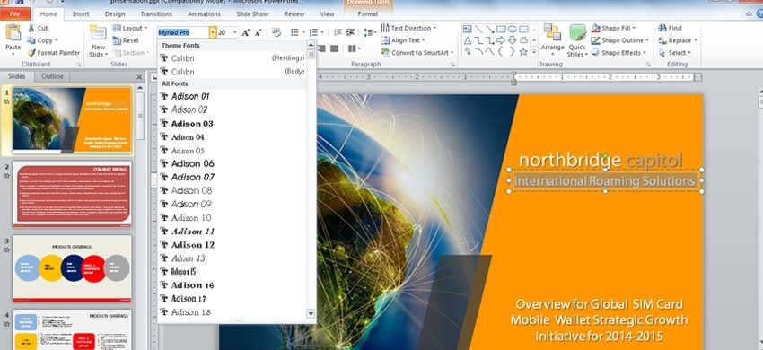
Generally, fonts can be segregated into 3 fundamental types, namely Serif, Sans-Serif and Script. Serif fonts like Times Roman, Bookman, Century etc., which possess some sorts of styles on the end of each letter, have a low legibility-quotient when the presentation is on a projector. They can definitely be used for title-texts where you can opt for larger text-size. They certainly elevate the style-quotient of your overall textual presentation. But undoubtedly, Sans-Serif font, which does not have anything at the end of the letters, is the most compatible font for a presentation. Sans-Serif fonts like Arial, Calibri, Century Gothic, Helvetica etc. are effortlessly legible and audiences don’t have to read the texts and understand them in steps. They can comprehend your presentation in one go in Sans-Serif fonts. They can be equally used for both, title-texts and body-texts. The structure and style of Script fonts has been created on handwriting. These fonts copy handwriting in principle. So, they are not easily legible on presentation-slides and the whole attention of your audiences will be spent on reading the texts in these fonts rather than comprehending the message. Additionally, the size of fonts can be kept between 32-40 for title-texts and 24-32 for body-texts, depending on your respective needs and choices.
Summarily, font-selection for textual content in a PPT or any presentation is not a random decision. The choice should be made on varied pros and cons, keeping the crux of the presentation in mind.